Project type: iOS App // Client: Ochsner Health System // Employer: Smashing Boxes
THE CHALLENGE
You are when you eat
Recent studies have shown that it’s possible to lose weight by compressing the total amount of time you eat every day into a 10 to 12-hour time period. This time period or eating duration aligns with your body’s Circadian Rhythm, otherwise known as your “internal body clock.”
Based these studies, we were engaged by Ochsner Health System’s innovation accelerator (Innovation Ochsner or iO) to create a weight loss application that focuses on compressing meals to a 10-12 hour time period. This is different than other weight loss applications that count calories, as this is based on research that suggests the number of calories consumed may not be as important as the total time of the day you are consuming said calories. The end users of this application were both patients and the general population and it was to be used for a weigh-loss study conducted at iO.
MY ROLE ON THIS PROJECT
Understand: Discovery research, user Interviews, personas
Analyze: Design synthesis (research summary)
Design: Design workshop, sketching exercises, paper prototypes, user flows, high-fidelity prototyping, user design critique, design system, UI and interaction design
Validate: Facilitated user testing sessions
Understanding our user
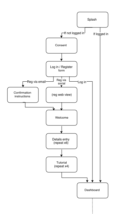
We conducted interviews with staff clinicians and patients at Ochsner to better understand the users’ behavior and painpoints. From this initial meeting, we formulated some key user flows and created personas to help us envision the people who use the app and how to support their needs.
Solution sketching
We facilitated an ideation session with stakeholders to get their feedback from a technical perspective. We drew paper sketches, white board flows and wireframed quickly sharing solutions, validating concepts, and rapidly iterating to accelerate the design process.
Testing an insight
Logging meals throughout the day can be time consuming and a pain in the ass. For this study to be effective, the experience needed to be easy to use and invisible. A possible solution was introduced during client solution sketching — the simple act of taking a picture of a meal might be all we need. Because we were only concerned with duration and nothing else, a time-stamped photo appeared to be a good solution for capturing duration. The photo really didn’t matter, but it captured the data we wanted. It was easy, intuiative and a standard convention. We decided to test this hypothesis by mocking up a camera interface and placing it in front of users to gain feedback.


